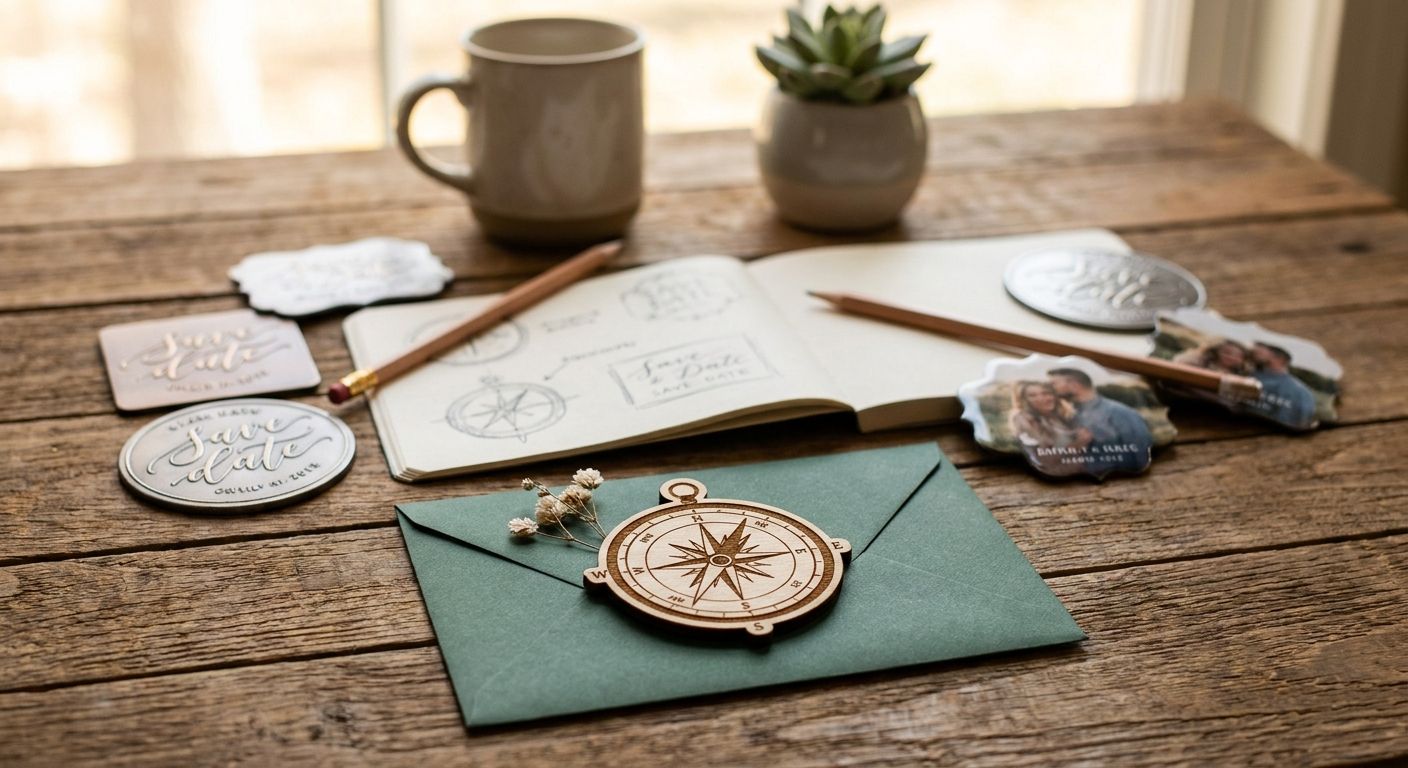
Save the date magnets that stand out use one full-bleed photo, a date set in bold type at least 36 points, and no more than two fonts on the whole card — anything else is decoration competing for attention. Size matters as much as layout: a 4x6 inch magnet reads clearly from across a kitchen, while smaller formats force guests to squint at the month and year before it slides behind a takeout menu.
- One full-bleed photo, a bold date and two fonts max make save the date magnets stand out in 2026.
- 4x6 inch magnets on 20 mil stock hold their shape on the fridge without curling or peeling.
- Photo-forward designs work best for engagement-photo weddings; typography-only designs age better for minimalist weddings.
- Skip low-contrast colour pairs and 8-point date text - both are the top reasons proofs get sent back for revision.
- Print Fast prints rush stationery for Toronto weddings running on tight timelines.
Why this matters
A save the date magnet gets one job: survive the fridge door for six to twelve months without getting buried under school notices and takeout coupons. Design choices that look sharp on a screen — thin script fonts, pale colour washes, tiny date text — disappear at magnet size and get lost fast.
Most couples design these in a rush between engagement photos and invitation deadlines, which is exactly when corners get cut on bleed margins and file resolution. Print Fast runs rush and same-day print jobs for Toronto businesses and organizations, so a design mistake caught the week before mailing still has a fix window when the file is set up right.
How to design save the date magnets that stand out
Follow this order and you avoid the two most common magnet design failures: text too small to read and a photo that gets cropped wrong at print.
- Pick one hero photo. A single sharp, well-lit photo beats a collage every time — collages shrink every face to postage-stamp size on a 4x6 inch card.
- Set the date first, then design around it. Lock the month, day and year in bold type at 36 points or larger before placing anything else.
- Limit yourself to two fonts. One display or script font for names, one clean sans-serif for the date and details. A third font is where designs start looking cluttered.
- Build in bleed and safe margins. Standard bleed is 0.125 inches past the trim edge; keep all text at least 0.25 inches inside the trim line so nothing gets cut off during finishing.
- Choose a high-contrast colour pairing. Dark text on a light background, or the reverse, reads instantly from across a room. Pastel on pastel does not.
- Match the mailing suite, not just the magnet. The magnet is usually the first piece guests see; keep its palette and fonts consistent with the invitation that follows.
- Proof at actual size. Print a test page at 100% and hold it at arm's length — anything hard to read on paper will be hard to read on a fridge.
- Submit print-ready files at 300 dpi. Lower-resolution photos pixelate once blown up to fill a 4x6 inch card, even when they looked fine on a phone screen.
Photo-forward vs typography-only vs illustrated: which design style fits
The three common approaches to save the date magnet design solve different problems. The table below breaks down where each one wins.
| Design style | Best for | Pros | Cons |
|---|---|---|---|
| Photo-forward | Couples with engagement photos | Personal, instantly recognizable to guests | Needs a genuinely sharp, well-cropped photo |
| Typography-only | Minimalist or modern weddings | Fast to design, ages well, no photo dependency | Falls flat without strong colour contrast |
| Illustrated | Destination or themed weddings | Sets the tone early, memorable on the fridge | Takes more design time, harder to DIY well |
Photo-forward magnets: best for couples with a strong engagement photo
A photo-forward magnet puts one full-bleed image behind the date and names, usually with a thin white border for contrast. Guests recognize the couple instantly, and it previews the wedding's visual style. The risk is a mediocre photo — low light or an awkward crop reads worse at magnet size than it did on a phone. Verdict: Buy when the engagement photos are sharp and well-lit; skip when the best shot is grainy or heavily filtered.
Typography-only magnets: best for minimalist and modern weddings
No photo, just names, date and a short line of copy set in confident type on a solid or subtly textured background. These age the best of the three styles because there is no photo to feel dated later, and they are the fastest to finalize when engagement photos are not ready. The tradeoff is that weak colour contrast makes them forgettable. Verdict: Buy for couples who want speed and a clean aesthetic; hold when the colour palette is not locked in.
Illustrated magnets: best for destination and theme weddings
A custom illustration — a skyline, a venue sketch, a motif tied to the wedding theme — sets expectations before the invitation arrives. This style works well for destination weddings where guests are booking travel and want a visual cue early. It takes longer to design well and is rarely a same-afternoon DIY job. Verdict: Buy when the wedding has a strong visual theme worth previewing; skip when the timeline is under two weeks.
Get a custom quote on rush printing
Same Day and 24Hr turnaround with local delivery and live support.
Why save the date magnet designs fail
Most rejected proofs fail for one of these reasons, not a lack of creativity:
- Date text under 24 points. It looks fine on a monitor and disappears at arm's length on a fridge.
- No bleed margin built in. Text or photo edges sitting at the trim line get clipped during cutting.
- Low-resolution photos. Anything under 300 dpi at final size pixelates once printed.
- Low colour contrast. Pastel text on a pastel background photographs fine but reads poorly in person.
- Too much copy. A save the date needs names, date, and a website or a short line saying details follow — not the full ceremony schedule.
- Mismatched fonts across the mailing suite. A magnet in one style and an invitation in another feels like two different weddings.
What size should a save the date magnet be?
4x6 inches is the standard save the date magnet size, matching common postcard mailers and fitting most fridge space without overlapping other items. Some couples go smaller at 4x5 inches to trim mailing weight, but anything under that compresses the date text past a comfortable reading size.
Is a magnet or a postcard better for a save the date?
Magnets stay visible for months on a fridge, while postcards usually get read once and filed away. Magnets cost more to produce and mail because of the added weight and stock thickness, so the tradeoff is longevity against budget. Couples who want the date top-of-mind through RSVP season tend to pick the magnet.
How far in advance should save the date magnets go out?
Save the date magnets typically mail six to twelve months before the wedding, with destination weddings on the longer end so guests can book travel. Local weddings can lean toward the six-month mark since travel planning is not a factor.
FAQ
What is the best size for a save the date magnet?
4x6 inches is the standard save the date magnet size in 2026, matching common mailer formats and fitting fridge space without overlapping other magnets. Smaller formats compress the date text below a comfortable reading size.
Is a magnet or a printed card better for a save the date?
Magnets stay visible on a fridge for months, while flat cards usually get read once and set aside. Magnets add weight and cost more to mail, so the choice comes down to visibility versus budget.
How many fonts should a save the date magnet use?
Two fonts is the practical limit: one display or script font for names, one clean sans-serif for the date and details. A third font usually makes the layout look cluttered at magnet size.
What bleed margin does a save the date magnet need?
A standard 0.125 inch bleed past the trim edge keeps photos and background colours from showing a white sliver after cutting. Text should stay at least 0.25 inches inside the trim line.
What magnet stock thickness holds up best?
20 mil stock is a common thickness for save the date magnets because it holds its shape on a fridge without curling. Thinner stock is more likely to warp in the mail.
Can I use a collage photo on a save the date magnet?
A single hero photo works better than a collage on a 4x6 inch magnet because collages shrink every face to a size that is hard to read. One sharp, well-cropped photo carries more visual weight.
Do save the date magnets need to match the wedding invitations?
Matching fonts and colours across the magnet and the invitation suite keeps the wedding's visual identity consistent for guests. A mismatched set makes the two mailings feel like separate events.
How far ahead should save the date magnets mail?
Save the date magnets typically go out six to twelve months before the wedding date, with destination weddings on the longer end for travel planning. Local weddings can mail closer to the six-month mark.
One last thing
The step skipped most often is not the design — it is the proof at actual size. A layout that looks balanced on a 27-inch monitor reads completely differently printed at 4x6 inches, because screen distance and fridge distance are not the same. Print one test page in 2026 before approving the file, tape it to an actual fridge, and walk across the room. If the date is not legible from six feet away, it will not be legible to a guest either.