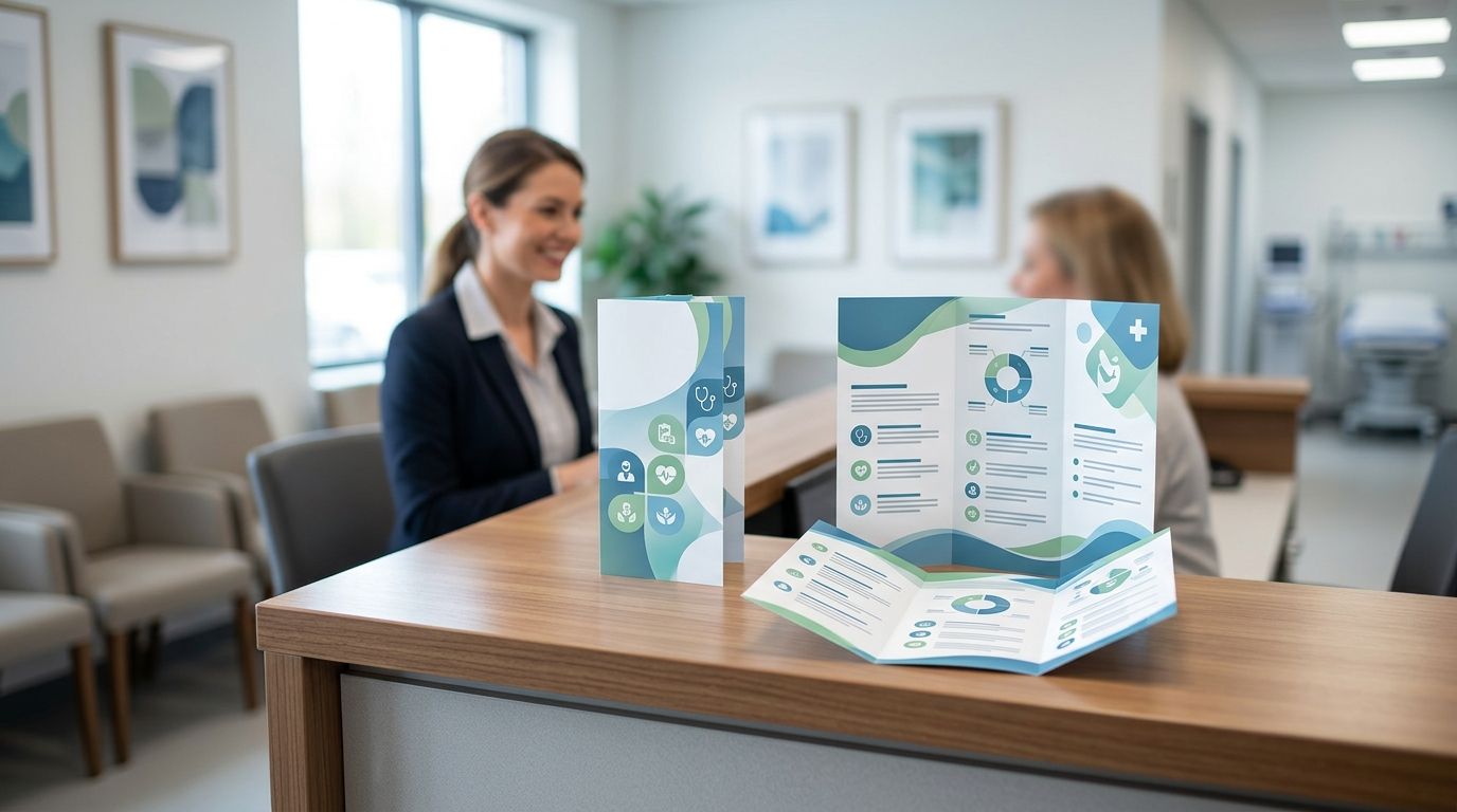
A medical clinic brochure is a printed piece — usually tri-fold, bi-fold, or rack-card format — that explains services, insurance basics, or a specific health program to patients sitting in your waiting room or walking in off the street. Clinics need something patients trust on sight: clean layout, current contact details, and no clinical jargon that reads like a consent form. That's different from a retail flyer, which sells a product; a clinic brochure has to educate first and market second.
- Tri-fold brochures for medical clinics work best for service overviews and new-patient onboarding in 2026.
- Rack cards fit tighter waiting-room racks and single-topic health campaigns better than tri-folds.
- Uncoated or matte stock reads easier under fluorescent waiting-room lighting than glossy stock.
- Print Fast offers Same Day and 24Hr rush printing for clinics in Toronto and the GTA needing a fast reprint.
Why this matters
A brochure sitting in a wall rack does one job: answer a question before a patient asks the front desk. Clinics that skip this step end up with staff re-explaining the same insurance question forty times a week. A well-built brochure for medical clinics also travels — patients take it home, hand it to a spouse, or leave it on a kitchen counter next to a bill. That's reach a poster on the wall never gets.
Business cards matter here too. If your clinic already orders business cards for dentists and medical clinics, the brochure should match that same visual system — same logo placement, same colour, same contact block — so a patient recognizes your clinic's print materials across every touchpoint in 2026.
Why brochures matter for medical clinics
Clinics run on repeat visits and referrals, not one-time impulse buys. A brochure explaining a new service — physiotherapy add-on, cosmetic dermatology package, extended pediatric hours — gives front-desk staff something to hand over instead of a rushed verbal explanation. It also gives a patient something to read while waiting, which is exactly when they're most receptive to learning what else the clinic offers.
Multi-location practices and family clinics in the GTA also use brochures as a bridge between visits. Pair a brochure with postcards for dental practice recall campaigns and you cover both the in-clinic moment and the six-month-later reminder without building two separate print systems.
How to plan brochures for medical clinics
Define the brochure's single job
Don't try to cover every service in one piece. A brochure that tries to explain billing, hours, staff bios, and three treatment options at once gets skimmed and tossed.
- New-patient onboarding (what to bring, what to expect at visit one)
- Single-service explainer (physiotherapy, dermatology, dental implants)
- Insurance and billing FAQ
- Seasonal health campaign (flu shots, back-to-school physicals)
- Referral program for existing patients
Choose the format that fits your rack
Most clinic waiting rooms use a standard literature rack sized for tri-folds or rack cards, not oversized sheets.
- Tri-fold (8.5x11 folded to three panels) for multi-topic overviews
- Bi-fold for a simpler, two-panel service summary
- Rack card (4x9) for single-topic campaigns that need to stand out in a crowded rack
- Postcard-sized handout for takeaway reminders at checkout
If you're building your first piece, walk through how to design a tri-fold brochure for small business before you open a design file — the panel order matters more than the copy in most first drafts.
Pick paper stock for waiting-room lighting
Glossy stock looks premium on a screen and glares under fluorescent lighting. Clinics generally read better on matte or uncoated stock, especially for anything with body text longer than a headline.
- Matte or uncoated stock for text-heavy service explainers
- Slight gloss or satin coating for photo-forward pieces (facility photos, staff photos)
- Heavier stock (100lb+) for anything meant to survive a waiting room for months
- Lighter stock for high-volume, frequently-replaced seasonal handouts
For a full breakdown of stock weight and finish, see how to choose paper stock for brochure printing.
Write copy patients actually read
Medical language that's accurate for a chart is confusing on a brochure. Write to the patient, not to a colleague.
- Lead with the outcome, not the procedure name
- Use plain-language headers ('What to expect', 'What it costs', 'How to book')
- Keep sentences under 20 words in the body panels
- Include current phone number, hours, and booking method on every panel
- List accepted insurance types if that's a common front-desk question
Design for accessibility and repeat handling
Clinic brochures skew toward an older patient base and get handled repeatedly before they're replaced.
- Minimum 10pt body text, larger for headers
- High colour contrast between text and background
- Avoid thin, light-weight fonts for body copy
- Round corners or a durable stock if the piece lives in a rack for months
- Bilingual panels where your patient base calls for it
Order the right run size and turnaround
Clinics update service lists, hours, and insurance info more often than a retail store updates its flyers. Order in batches you'll actually use before content changes.
- Small batch (100-250) for single-provider or single-service pieces
- Larger batch (500+) for general clinic overviews with a longer shelf life
- Same Day or 24Hr turnaround when a health campaign or open house is on short notice
- Rush reorders when a rack empties faster than expected
Print Fast runs Same Day and 24Hr rush printing out of Toronto for clinics that need a reorder before the next batch of patients walks in.
Comparison: brochure formats for medical clinics
| Format | Best for | Key limitation |
|---|---|---|
| Tri-fold brochure | Multi-service overviews, new-patient onboarding | Too much text if limited to one topic |
| Bi-fold brochure | Simple two-panel service summary | Less space than tri-fold for detail |
| Rack card | Single-topic seasonal campaigns | Not enough room for FAQ-style content |
| Postcard handout | Takeaway reminders, recall mailers | Not built for in-depth explanation |
Verdict: for most GTA clinics, a tri-fold brochure covers general service overviews best, while a rack card wins for a single seasonal campaign like flu shots or back-to-school physicals.
“A brochure that needs a magnifying glass gets left in the rack.”
Common mistakes medical clinics make
- Outdated insurance and billing info — clinics reprint slowly, so a brochure printed two years ago can list plans the clinic no longer accepts.
- Overloading one panel with three services — patients skim, they don't read a wall of paragraphs on a single fold.
- Ignoring font size for an older patient base — 8pt body text on a health brochure is a readability failure, not a design choice.
- Printing a year's supply of a seasonal campaign — flu-shot or back-to-school brochures go stale fast; order in smaller batches.
- Skipping a bilingual panel in diverse GTA neighbourhoods — a single-language piece misses patients who'd otherwise read it.
Get a quote for clinic brochures
Same Day and 24Hr rush printing for clinics across Toronto and the GTA.
FAQ
What's the best brochure format for a medical clinic?
A tri-fold brochure works best for general service overviews and new-patient onboarding in 2026, while a rack card fits single-topic seasonal campaigns better.
Is glossy or matte paper better for clinic brochures?
Matte or uncoated stock reads easier under waiting-room fluorescent lighting, especially for text-heavy pieces. Glossy works better for photo-forward panels with less body copy.
How often should a clinic reprint its brochures?
Reprint whenever insurance info, hours, or service lists change, and order smaller batches for seasonal campaigns so you're not stuck with outdated stock.
Can Print Fast print clinic brochures same-day?
Print Fast offers Same Day and 24Hr rush printing out of Toronto, which covers last-minute reorders before a rack empties.
What size brochure fits a standard waiting-room rack?
Most literature racks are built for a tri-fold (8.5x11 folded to three panels) or a 4x9 rack card. Check your specific rack before ordering a custom size.
Should a clinic brochure be bilingual?
In diverse GTA neighbourhoods, a bilingual panel captures patients a single-language piece misses entirely, so it's worth the extra panel for many practices.
What's the minimum font size for a clinic brochure?
Keep body text at 10pt minimum given the older patient base clinics typically serve, with larger sizing for headers and key contact info.
Do brochures work better than posters for patient education?
Brochures let patients take the information home, which extends reach past the waiting room in a way a wall poster can't.
One last thing
The brochure that gets read twice isn't the one with the most information — it's the one a patient can finish before their name gets called. Keep each piece to one job, one topic, and one clear next step, and reorder in batches small enough that nothing goes stale before the next update.